Appearance
Fonts and Text Rendering
Font family, size, weight, and ligatures.
The same file rendered across a few monospace families:
Install font
Otty can read fonts you've installed on your system.
Otty auto-discovers any font you drop into:
~/.config/otty/fonts/You do not need to install fonts system-wide via Font Book — Otty registers files in this folder with CoreText at launch, so they're available to the Font Family picker and to font-family in config.toml.
Accepted formats
.ttf, .otf, .ttc, .otc (other extensions are ignored, case-insensitive).
Steps
- Open the folder. From the in-app picker: Settings → Appearance → Font Family → Open font folder. Or in a shell:
open ~/.config/otty/fonts. - Drop a font file (
.ttf/.otf/.ttc/.otc) into the folder. You can drop a whole release zip'sttf/contents — Otty filters by extension and ignores anything else. - Open Settings → Appearance. The font now appears in the Font Family combobox.
If Settings was already open when you added the file, close and reopen the Settings panel to trigger a rescan.
CLI
You can also run otty font import <font file path> to import fonts from local files.
Change Font
Apply the font
After it shows up in the picker, set it from Settings → Appearance → Font Family:
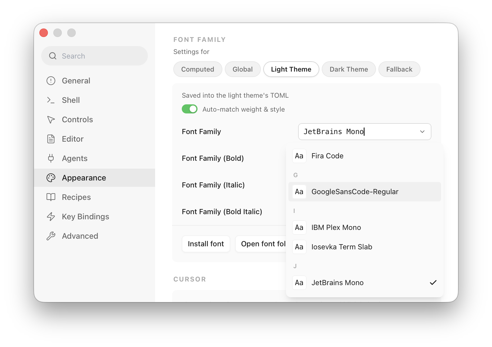
- Global — writes to
~/.config/otty/config.toml, applies everywhere. - Theme — writes to the active theme TOML, travels with the theme.
- Fallback — comma-separated list, used when the primary font lacks a glyph (CJK, icons).
Or edit config.toml directly:
toml
font-family = "Iosevka Term"
font-family-fallback = "Sarasa Mono SC, Symbols Nerd Font Mono"
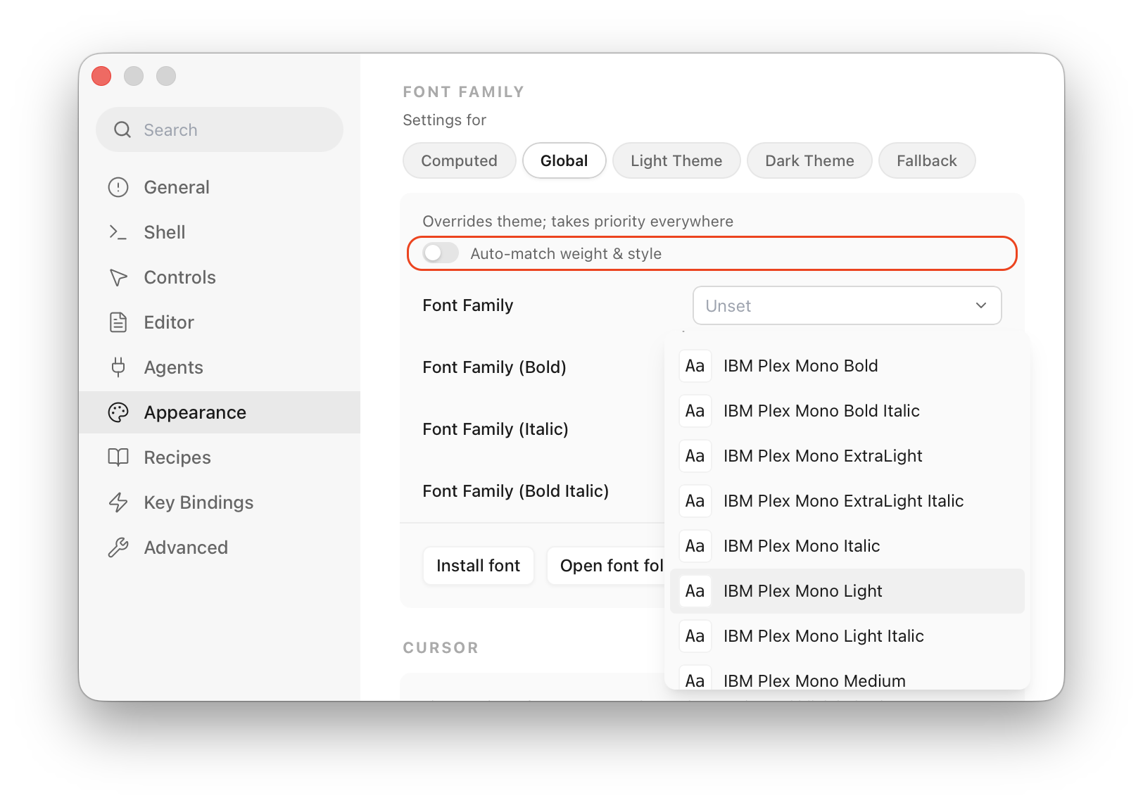
font-size = 13Use different font weight
By default the system picks bold / italic variants of the active family automatically. To override, turn off the Auto-match weight & style toggle, then pick fonts under all variants / weights:
Font Size
You can configure font size from Settings → Appearance → Text, from the menu bar, or using the shortcut keys ⌘+/⌘-/⌘0.
Line Height (Cell Height)
You can configure line height from Settings → Appearance → Text. Options are:
- Default: Use what your theme TOML defines
- Compact: Use line height of 1.0
- Loose: Use line height of 1.2
- Custom: Set your own multiplier, like 1.0 or 1.5. Or choose
Adjust Cell Heightto add or remove a fixed number of pixels from the current cell height.
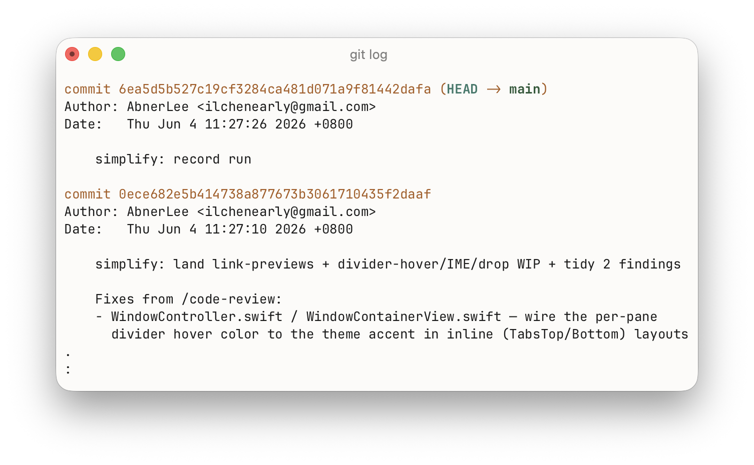
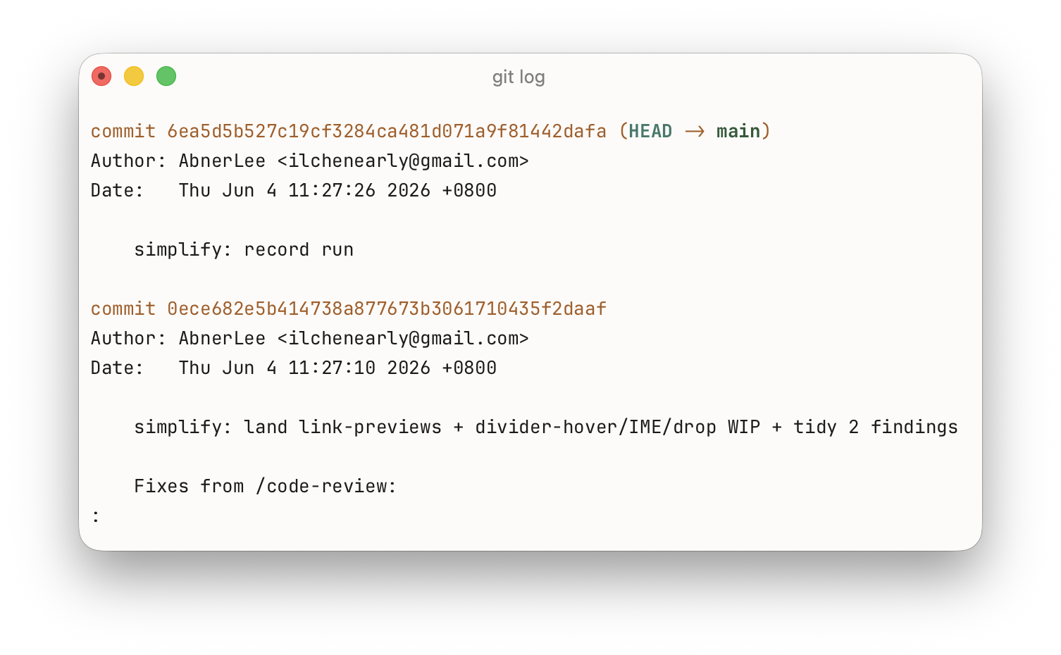
The same git log, Compact vs Loose:
Text Rendering
Ligatures
You can configure text ligatures from Settings → Appearance → Text.
Values:
off— no ligatures (default).calt— standard ligatures plus contextual alternates (=>,!=,>=, …).dlig— also enable discretionary ligatures.
Usually, their difference is (samples below are from the Iosevka font):
| Setting | What it does |
|---|---|
off | Ligation off — glyphs render individually. |
  | |
calt | Standard ligatures and contextual alternates — the default in most editors. |
  | |
dlig | Everything in calt plus discretionary ligatures. |
  | |
By default ligatures are suppressed inside runs of letters and digits (so they only fire on symbol sequences). To apply them everywhere, add:
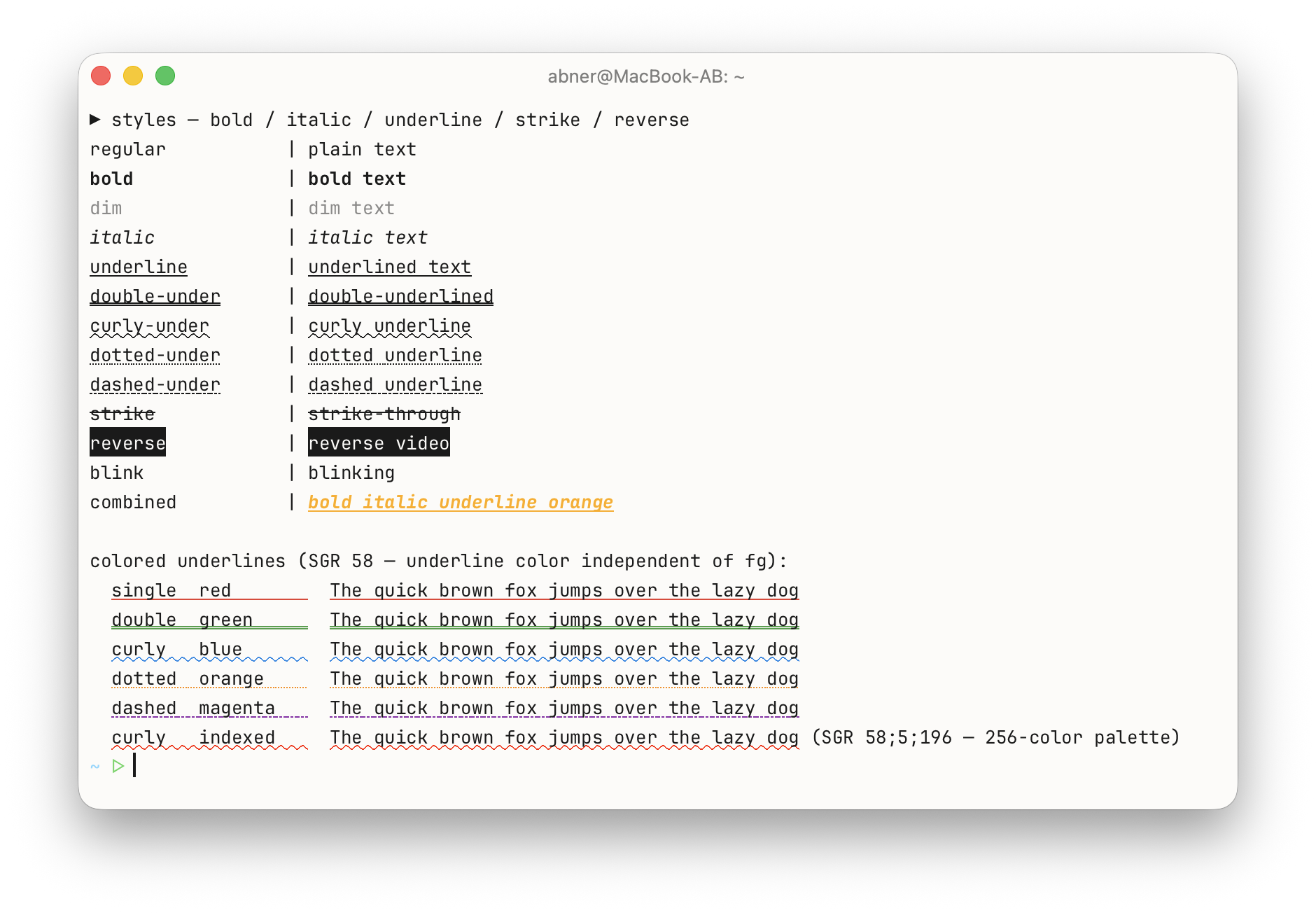
font-ligatures-alphabet = trueText Style (Bold / Italic / Underline / Blink)
Programs running in the terminal can ask for text to be bold, italic, underlined, or blinking (through standard SGR escape sequences). From Settings → Appearance → Text you decide how Otty honors each of those requests.
Bold and Italic each offer four modes:
- Auto (default) — use the font's real bold / italic face, borrowing from your fallback fonts if the primary family doesn't ship one.
- Off — ignore the request entirely: bold text renders at normal weight, italic text stays upright. Handy when a font's bold is heavier than you like.
- Primary Only — use the bold / italic face only when your primary font has one; never pull it from fallback fonts.
- Synthetic — when no real face exists, fake it: Otty algorithmically thickens (faux bold) or slants (faux italic) the regular glyphs.
Underline (on by default) — whether underlined cells actually draw the underline. Turning it off only affects SGR underlines; link underlines (⌘-hover / OSC 8) and strikethrough are unaffected.
Blink (off by default) — some programs mark text as blinking (SGR 5 / 6). Left off, blinking text renders steady; turned on, those cells blink on and off at about 1 Hz. It's off by default because blinking is an accessibility concern and is more often emitted by accident than on purpose.
Font Blending
Settings → Appearance → Text → Font Blending controls how glyph edges are anti-aliased onto the background — which mostly changes how thick thin text looks, especially dark text on a light theme.
Unless your text looks too thin or too heavy, leave this on Default. Each mode below is shown in both a dark and a light theme:
| Setting | What it does |
|---|---|
Default | Defer to the active theme (which falls back to srgb-over). Recommended. |
srgb-over | Otty's baseline; blends so stroke weight lands where the font designer intended. |
  | |
macos-like | Matches the platform's native blending (on macOS, the Display P3 path), closest to how other Mac apps render text. |
  | |
linear | Physically-correct linear-light blending. Pure white stays pure white, but thin dark strokes come out ~15% lighter. |
  | |
perceptual | Like linear, but boosts thin dark text back toward its intended weight. A good pick if you like linear but find text too faint. |
  | |
It's a subtle, taste-driven setting — switch between a couple of modes with text on screen and keep whichever looks crispest to you.
See also
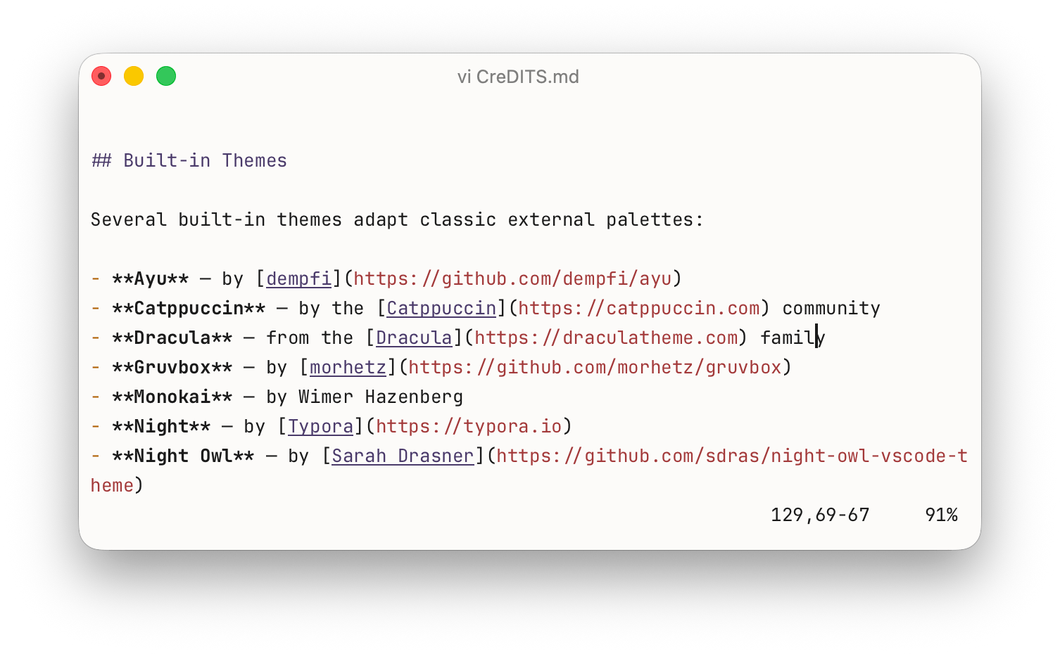
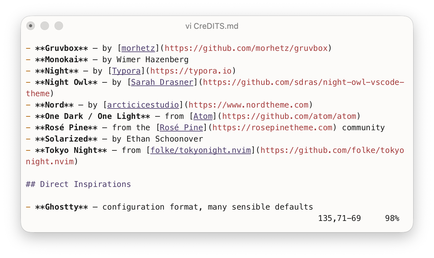
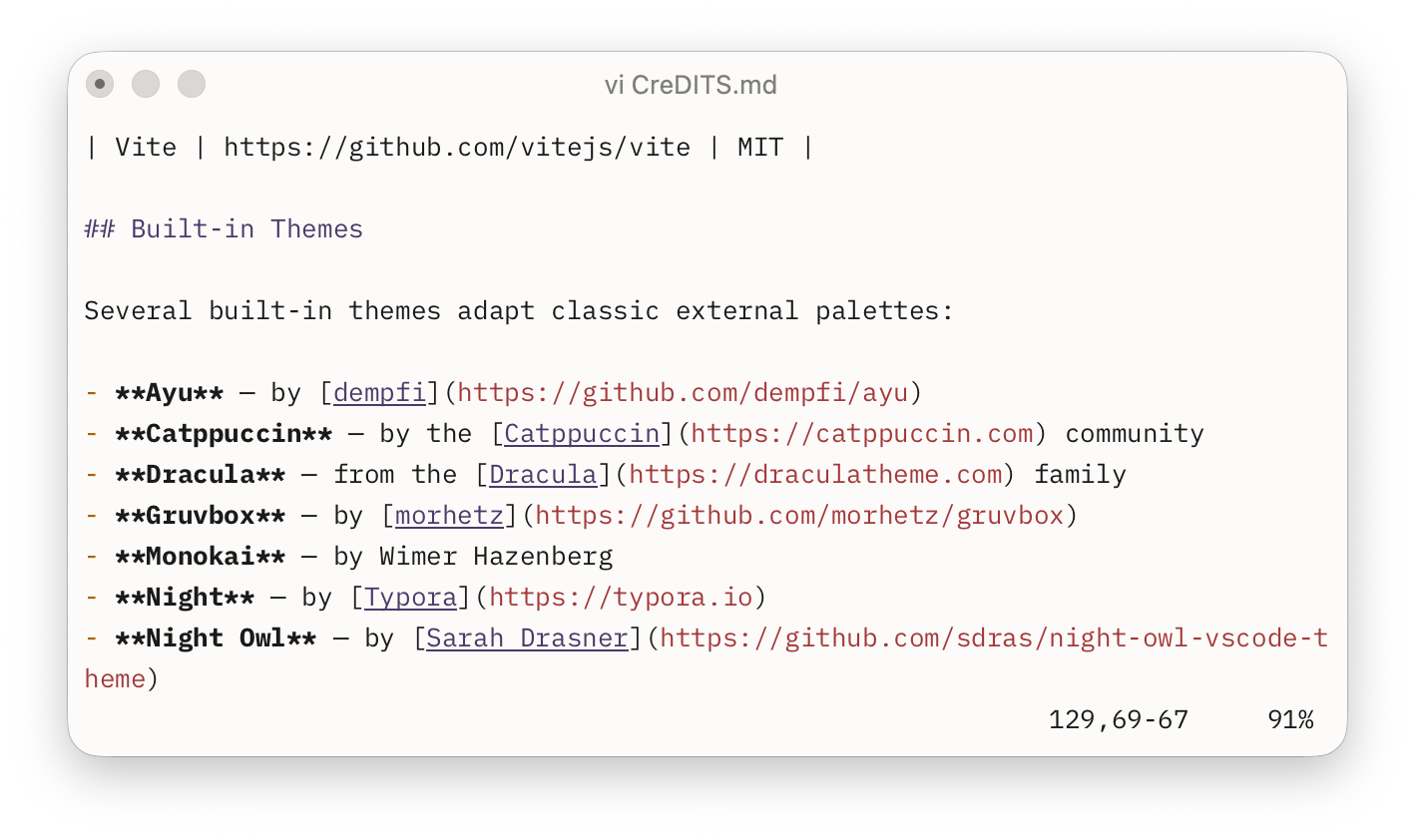
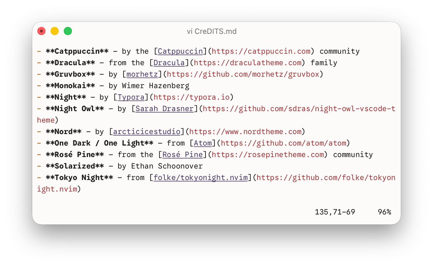
- Themes — pairs with font choices.
- Unicode and Text Styles — how glyphs flow through the renderer.